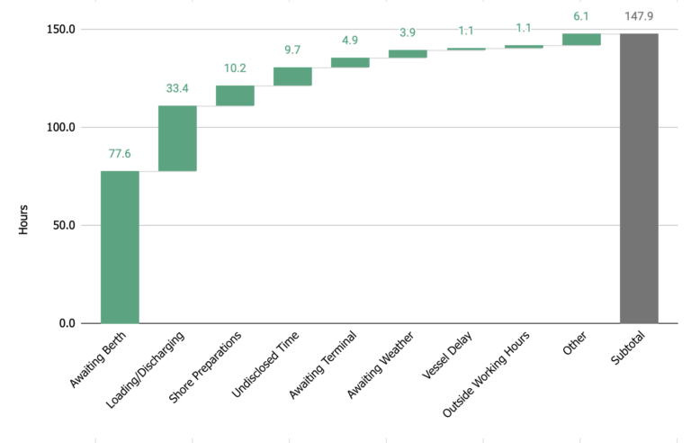
Via a waterfall view – an illustrative format for visualizing how time is distributed among the key port call processes and unplanned delays – we aim to empower operations and demurrage teams, displaying how a port stay can transpire.
The graph below reflects a number of dry cargo operation loads that took place in Santos, Brazil, over the last year. Averaging out a given process’s (1) duration and (2) frequency, analysis can quickly and easily see what percentage of their port call is spent in operations (ideal), awaiting congestion or other delays (not ideal), and more.

Breaking down the allocation of time in such a manner can provide valuable insight, in the right hands – by dissecting it, we shed light on the impact that each process has over the entire port call duration.
We also identify where optimization can be further explored, or at the very least know what to expect during the next port visit – from being able to budget demurrage costs, to negotiating better clauses, as well as reducing the chances of interrupting supply chain flow.
Voyager automatically provides waterfall analyses such as these as SOFs are added, allowing our customers’ analysts to immediately jump into problem-solving. Stay tuned for more specific use-cases, like how Voyager was used to identify “long surveyor wait times” and ultimately change surveyor behavior.


